
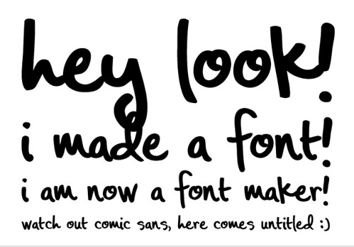
 It all started with a concept pitch for Bealls. Dalton needed three words for a subhead in a handwritten style and couldn't find a font that was just right, so they asked me to jump in. "No prob," I said. I just wrote out the words, scanned them in, did a little live tracing in Illustrator, and done. Easy peasy. We sent the concepts to the client and they liked the script so much, they asked for the font. Thus began my font making adventure.
 Prior to this, I'd never even thought to make a font. I've always thought, "There are so many out there already. Anything I could make would just be redundant." So, when they gave me the task of finding a font editing program, learning how to use found program and creating a usable font, I was a little overwhelmed and, honestly, a little unmotivated.
 I started to research font editing programs and decided on FontLab. Then I saw the price, and settled on Fontographer. I had no idea what I was doing, so I started looking for tutorials and found TONS for FontLab but NONE for Fontographer. Luckily, they're pretty similar programs. FontLab definitely has more advanced features, but Fontographer was fine for what I needed. After about a day of trial and error, I started to get a handle on it and out came--duh duduh DUHHH: Untitled. I know, not the best name. After figuring out an entire program and creating my own font, I couldn't for the life of me figure out how to actually name the font. I tried everything, resaving, renaming, yelling, but nothing. If any of you know how do this, PLEASE let me know and I'll let you name it!
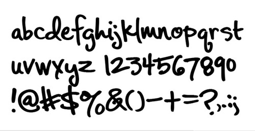
As to the font design, I'm not sure it's the most refined font. Just looking at it now, I can see so many problems (line weight variations, kerning issues with 'e's and 'n's, etc.), but I'm still pretty proud of it. It only has a lower case set, because the campaign it was designed for only uses lower case letters. If the client doesn't end up buying sole rights to it, I'll probably add an uppercase set and more glyphs, but for now it gets the job done.
So, whaddaya think? See any glaring problems with it? Any tips/tricks that could help me out in my next typemaking venture? Lemme know! Thanks, guys! And sorry it's been so long since my last post. I broke my camera and it's been hard to document stuff. If any of you have an old camera laying around, my brithday's coming up...Just sayin'. :)
5 comments:
AMAZING!!!!! I love it! I want it!
!!!!!!!!!!!!!!!!!!!!! and
!!!!!!!!!!
yay.
:D
I'm so glad you made a font because you have gorgeous handwriting. Cool!
You guys both have the same handwriting! I should call it, "The Robinson Girls!" :)
I love it!!!! Hey The Robinson is a great one how about OKeefe?
Awesome! I actually rather like the oddities in line weight and kerning. Though, it would be pretty impossible to make heavier weights (super bold would be hilarious). A thin would be fun, though.
Post a Comment